


 by Tom Gurney
Tom Gurney BSc (Hons) is an art history expert with over 20 years experience
Published on June 19, 2020 / Updated on September 27, 2026
Email: tomgurney1@gmail.com / Phone: +44 7429 011000
Colour in practice and theory
Colour in a Paul Klee painting can look spontaneous: a patch of orange appears to lean towards blue; a veil of watercolour lets a darker passage show through; neighbouring squares seem to change one another. Those effects were made through choices of material, sequence and proportion. Klee spent years finding confidence with colour, and his Bauhaus teaching gave him a language for asking how colours relate. It did not produce a formula that explains every painting. The most useful way to read the work is to keep three kinds of evidence in view: what the object visibly and materially does, what Klee said or drew at a particular date, and what later scholars infer from the two.[1][2][3]
This page follows his development from tonal experiment and transparent watercolour through his lessons on the colour circle, triangle and sphere, then tests those ideas against identified works. It also distinguishes Klee's own published diagrams from the far larger archive of notes later rearranged by editors. A colour wheel is a map of possible relations, not a key that unlocks a picture without looking at it.[2][4]
Contents
- Why was colour difficult for Klee at first?
- What did he do with transparent colour?
- What did Klee actually teach about colour?
- Goethe, Runge, Ostwald and the problem of a “colour theory”
- What do particular paintings show?
- How did material change the colour of a late painting?
- Does musical language explain his colour?
- How should a viewer use the lessons?
Why was colour difficult for Klee at first?
Klee's early reputation rested strongly on drawing. His first oil experiments in Munich did not immediately make him feel at ease as a painter. The Zentrum Paul Klee documents his early use of muted, often dark oil colour and his own expressed uncertainty. In watercolour, too, he initially worked through gradations of grey before committing to more varied hues. The institution dates a sustained use of coloured watercolour to around 1910. That chronology matters: the artist who later became known for luminous colour had a long preparation in line and tonal value.[1]
Glass painting offered another kind of experiment. Between 1905 and 1916, Klee made a substantial group of works on glass, including works built with restricted light and dark as well as coloured and scratched passages. The smooth support changes how a mark can be laid down and seen. Neither these experiments nor the early grey washes are failed preliminaries to an inevitable colourful style. They show him testing the separate powers of contour, value, support and pigment before bringing them together.[1]
The April 1914 journey to Tunisia with August Macke and Louis Moilliet was a turning point in Klee's account of himself. His diary's declaration of being a painter has become shorthand for a sudden discovery of colour. The wording belongs to a diary Klee later edited, however, and it should be read beside works made before the trip, watercolours made during it, and sheets he changed after returning. The Tunisian light and architecture became powerful resources, but they did not make all previous learning disappear. On the journey he observed places, made paintings and sketches, and later reconsidered how some sheets should be mounted or divided. The dedicated Tunisia and Hammamet with Its Mosque pages follow that evidence work by work.[1][5][6]
Klee's contact with Robert Delaunay was another part of this longer development. The documented Paris visit belongs to April 1912, despite a contradictory February date in one passage of Marianne Keller Tschirren's dissertation. Discussion of Delaunay's colour and light helped frame what Klee was exploring before Tunisia. Influence here is a question of encounter and artistic comparison, not a claim that a later Klee work simply applies a Delaunay scheme.[2][5]
What did he do with transparent colour?
A wash of watercolour can tint the support without hiding it. Another wash, placed beside or over it, makes a new relation. The Zentrum Paul Klee describes Klee wetting paper and laying down watery colour in transparent layers; during the Bauhaus years he developed unusually subtle gradations and overlaps. The result depends on paper, moisture, pigment, sequence and how much of an earlier layer remains visible. It is misleading to call every such effect a fixed mixture of two named hues. One may be seeing one colour through another, or an edge where two washes meet.[1]
Klee could also set a dark passage against a light support, use a coloured mount as part of the apparent field, or let a prepared ground affect the colour above it. A painting's chromatic structure is therefore inseparable from its construction. This is why an object record matters. A reproduction may make two neighbouring areas look evenly painted, while closer inspection reveals a wash over a ground, opaque paste colour, or the texture of gauze or cardboard. The separate materials and techniques page follows those processes in detail; here their relevance is that the same named hue can behave differently on different supports.[1][7]
Klee's colour was not confined to transparent watercolour. The Zentrum Paul Klee describes spraying becoming important to him from about 1925 and paste-colour experiments expanding from about 1930. Such methods can soften an edge or thicken a surface in ways a simple circle of hue relationships cannot describe. Their dates also prevent a later studio technique from being projected back onto a 1914 sheet merely because the colours look similar in a small image.[1]
What did Klee actually teach about colour?
His most sustained colour lessons began on 28 November 1922, in the Bauhaus winter term. Keller Tschirren reconstructs the sequence from Klee's Beiträge zur bildnerischen Formlehre, later lesson papers and students' notes. Klee named Goethe, Philipp Otto Runge, Eugène Delacroix and Wassily Kandinsky among the earlier points of reference. He wanted students to have an ordered set of possibilities for making, rather than a universal law that would dictate a finished painting. His order was an artist's practical instrument, developed and revised across classes.[2][3]
A first distinction was between light and dark and hue. A graded passage from black to white lets students observe tonal weight and interval even before a hue is chosen. In coloured work, the apparent lightness of a red or blue depends on its neighbour and on the material beneath it. Klee's 1924 Jena lecture, as discussed by Keller Tschirren, distinguishes line as measure, light and dark as weight, and colour as quality, then brings them together in construction. That is a useful way of noticing separate decisions, provided one does not claim every painting can be split into three independent layers.[2]
Klee began the 1922 sequence with the rainbow, then challenged its usefulness as a classroom diagram. The visible arc presents a row; a closed circle can relate hues on both sides and across a diameter. He preferred a six-part arrangement to a sevenfold musical analogy. It is an arrangement for thinking pictorially, not a correction to the physical spectrum. His notes even show him later changing the word for a fixed “scale” to one implying movement. The revision is evidence that he did not regard the teaching vocabulary as complete and untouchable.[2]
In a six-part circle, red and green, blue and orange, and yellow and violet are opposing pairs. Klee explored what happens at a diameter and what happens while moving around the circumference. He used the eye's afterimage, the physical mixing of pigments and transparent superposition as related but different examples. His lessons also considered pairs that did not sit exactly opposite one another: the resulting coloured greys might be artistically productive. The old page's claim that yellow and violet are the uniquely “most different” pair misses the structure of the lesson. Klee was testing balances, movements and departures from ideal pairs, rather than issuing a single ranking of contrast.[2]
A colour circle does not show every difference of brightness or saturation. Klee also worked with a triangle, placing red, yellow and blue in dominant positions and secondary colours between them. He considered how each secondary hue can lean towards either parent, and how the clean geometric scheme becomes more fluid in a wash. Keller Tschirren compares this teaching with Runge's earlier account and with Delacroix's colour triangle; she treats particular derivations as probable or possible, rather than proving that every similar diagram came from one source.[2]
The sphere adds light and dark to relations shown around a circle. White and black can serve as poles, with hue and grey changing through its surface and interior. Klee engaged closely with Runge's model while using it for his own question of how pictorial movement could be balanced across both hue and value. A sphere is helpful precisely because a dark blue and a pale orange can be related without pretending they are the same as two fully saturated colours on a flat wheel. Still, the classroom model is a diagram of possibilities. Klee's own notes distinguish organising colour from composing a particular work.[2]
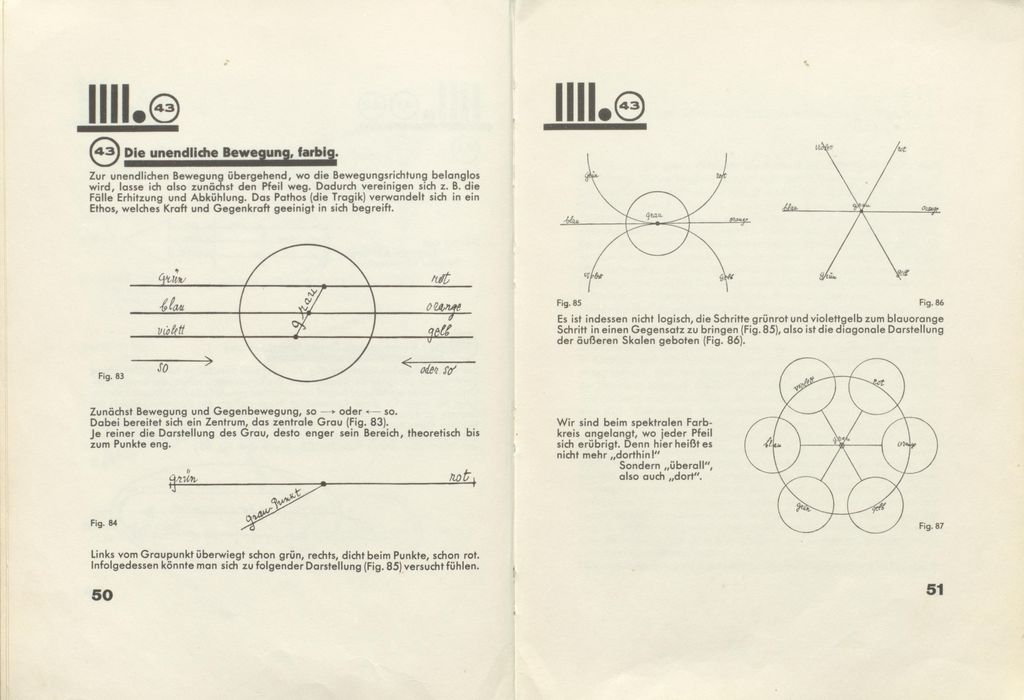
The reproduced spread makes that last point visible. On the left, green/red, blue/orange and violet/yellow movements approach a central grey. On the right, Klee says one arrangement would give an illogical sense of how the steps relate and tries a diagonal alternative before a circular organisation. The page is printed in black ink, so it cannot show the exact pigments of a studio exercise. It does show thought in motion: a visual explanation is corrected because its form changes its meaning. Readers should also notice that the 1925 Pedagogical Sketchbook was a short book Klee chose to publish during his lifetime, not a complete record of all the lessons he delivered.[4][8]
Goethe, Runge, Ostwald and the problem of a “colour theory”
Goethe's Zur Farbenlehre was published in 1810, as the Klassik Stiftung Weimar's original-material collection confirms. The legacy page's date of 1840 confuses this publication history; Keller Tschirren notes that Klee owned and marked an 1840 edition. Goethe's attention to perceived complementary effects and colour experience mattered to Klee's discussion, as did Runge's effort to give colour a spatial order. Klee selected and altered their models for painters. He did not simply inherit an entire historical theory unchanged.[2][9]
Wilhelm Ostwald presented a more standardised and scientifically framed system. Klee read and argued with him, so it would be wrong to erase that contact. But the artist resisted the idea that fixed samples and prescribed harmonies could contain the variable results of painting, particularly layered and relative colour. His response was sometimes sharply polemical. Keller Tschirren follows both his early reading and later classroom comparison; she also warns that the date and classroom use of one surviving anti-Ostwald diagram are uncertain. A manuscript page's presence in the archive does not prove it was shown to a particular class.[2]
The disagreement was more specific than a rejection of all technical experiment. Conservator Nathalie Bäschlin reproduces a 1904 letter in which Klee warmly recommended Ostwald's Malerbriefe, including its instructions for making pastel sticks. She also documents his later sharp objection to Ostwald's standardised colour order. Bäschlin sees technical overlaps in the low-binder, textured colour of Klee's late work, alongside differences from Ostwald's recipes. The 1904 letter is known here through her citation of a published correspondence edition, not from direct inspection of the original letter. It shows why a painter could find a material procedure useful while disputing a prescriptive theory of harmony.[16]
This is also where a modern account must be precise about science. An optical afterimage, a physical spectrum, pigment stirred together and washes laid over one another are different phenomena. Klee moved among them in an artistic lesson, often through metaphor and visual experiment. Keller Tschirren finds no good evidence for the legacy page's strong claim that Newton's theory directly governed his teaching. His criticism of a fixed Ostwald standard does not mean he never investigated what a scientific system might offer. It means the artistic question could not be settled by the system alone.[2]
Some institutional writing calls his Bauhaus teaching an independent colour theory; Keller Tschirren says he did not create a colour theory “in the strict sense”. The accounts differ mainly in what they mean by theory. Klee devised an individual, changing teaching practice from inherited diagrams, optical observations and his own making. He did not invent the colour circle, nor leave a single final manual that assigns each colour a fixed emotional meaning or instructs viewers how to decode every painting.[2][3]
What do particular paintings show?
A comparison needs a securely identified work, its date and its materials. Crystal Gradation (Kristall-Stufung, 1921,88) is a watercolour on paper, bordered with brush and pen on cardboard, held by Kunstmuseum Basel. Its stepped geometry and transparent colour can be brought into conversation with Klee's early Bauhaus questions about movement and gradation. Yet the work belongs to 1921, before the sustained late-1922 circle lessons described above. It cannot be an illustration made after those lectures. Its layered appearance should be read from the sheet and its support, not reduced to a hypothetical numbered wheel.[10]
Ancient Harmony (Alter Klang, 1925,236) is a Basel oil painting on cardboard nailed to a frame. Its coloured compartments invite comparison with Klee's terms for tonal relation and pictorial balance. The painting's title offers a musical word, but no evidence turns each square into a note in a recoverable score. Its grey and broken colours can hold a field together while their differences remain active. The dedicated object page traces the title, medium and institutional record separately from later musical interpretation.[11]
The Zentrum Paul Klee's Farbtafel (auf maiorem Grau), catalogued in specialist scholarship as 1930,83, offers a particularly helpful later example. Its digital guide describes roughly square and rectangular fields on black-primed paper, made with paste-bound pastel colour. Some hues were mixed on the palette and others through layers. Grey is the predominant or maior presence named in the title. The guide explicitly connects the work with earlier square pictures and Runge/Goethe teaching while stressing Klee's intuitive use. The guide's display number 215 is not Klee's work number, so the two should not be confused. Here a practical question from the class—how quantity and relation change the whole—finds a plausible studio comparison, without requiring the painting to follow a precise diagram.[2][12]
Ad Parnassum, 1932,274, was made after Klee left the Bauhaus. Its accumulated small marks and large structure make the analogy with rhythm attractive. But a later painting cannot be read as a document of a specific 1922 class simply because both use repeated units. The work's object record and construction need to govern any claim about its material and appearance. Similarly, the late picture New Harmony is distinct from Ancient Harmony; a repeated English word does not make the two works a matched lesson pair.[13][14]
Keller Tschirren tests several further gradation and square works against the teaching sheets. In one unusually close case, Studie (1928,60), she identifies a surviving class sketch related to the work but observes that Klee still changed planned colours. That exception is revealing. The stronger the documented link between drawing and painting, the easier it becomes to see the artist depart from his own first arrangement. Formal likeness without such a document supports a comparison, not a claim of direct execution.[2]
How did material change the colour of a late painting?
Bäschlin's direct examination of Legende vom Nil (Legend of the Nile), 1937,215, supplies an answer that a colour diagram cannot. Klee attached a smaller white cotton cloth to jute on a stretcher. He placed ochre signs and blue, green and lilac fields beside one another, leaving narrow lines of textile visible between them. The paint was worked both with pastel-like sticks and in a brushable form; an opaque yellow-ochre border in paste tempera came last. Bäschlin's sample analysis identifies Prussian blue in one stick-applied area and suggests cobalt blue in a brush-applied passage. Colour difference here involves method and material as well as position within a pictorial scheme.[16]
The paint's low binder content helped its matte, saturated appearance, while leaving the surface weakly attached and sensitive to movement. Bäschlin found a protein-rich binder with varying oil content and traces of shellac; wax is a possibility, not a confirmed ingredient. This material account explains a late colour effect without claiming that every Klee picture used this mixture. It also cautions against reading precise application or pigment identity from a small online reproduction. The work is recorded as Kunstmuseum Bern Ge 045, in the Hermann and Margrit Rupf Foundation collection; no image from the conservation publication is reused here.[16]
Does musical language explain his colour?
Klee was a practising violinist, and musical terms recur in his writings and titles. The Zentrum Paul Klee's Italian guide explains pictorial polyphony through transparent layers and multiple levels of a surface. It distinguishes a one-level, homophonic order from overlapped levels with several simultaneous visual “voices”. This can help a viewer describe a coloured composition that cannot be taken in as one flat sequence. It does not establish a literal sound for each pigment.[15]
In paintings made of squares, the word harmony can point to intervals, balance or a sense of multiple parts forming a whole. It can also tempt a critic to force a colour-to-note code for which no work-specific evidence exists. The more rigorous route is to identify what repeats, what changes, where a darker band or lighter area interrupts a pattern, and how the support affects the apparent hue. If a title, artist's note or contemporary source makes a musical relation explicit, that evidence can then deepen the reading. The music page follows those questions in their own right.[11][15]
How should a viewer use the lessons?
Begin with the object: name it accurately, find its date, current collection and medium, then look closely at its divisions, edges, overlaps and support. Next ask which of Klee's ideas were available when he made it. The 1922 circle, a 1925 printed diagram and a 1930 manuscript folio belong to different moments; none should be slid backwards or forwards without evidence. Finally, check whether a claim comes from Klee's own page, a student's record, a posthumous edition or a scholar's interpretation. The notebooks page explains why those layers of documentation cannot be collapsed.[2][4]
Klee's colour is compelling partly because ordered thought and contingent making remain visible together. A red against green may activate a relation he taught, but its force in a particular work also depends on area, value, texture, sequence and the colours nearby. A wash can make light seem to arise within the paper; a dark ground can make broken hues appear to glow. The lesson gives questions to ask. The painting gives the evidence with which to answer them.[1][2][12]
Explore selected works from Klee’s much larger oeuvre. Titles without a link have an authenticated catalogue identity but no reviewed article yet.
Artworks directory
| Name | Date | Medium |
|---|---|---|
| A Gate | 1939 | Painting and mixed media |
| A Woman for Gods | 1938 | Watercolour and mixed media |
| Ab Ovo | 1917 | Watercolour and mixed media |
| Above Mountain Summit | 1917 | Drawing and mixed media |
| Abstract Trio | 1923 | Drawing and mixed media |
| Acrobats | 1915 | Watercolour and mixed media |
| Actor's Mask | 1924 | Painting and mixed media |
| Ad Marginem | 1930 | Drawing and mixed media |
| Ad Parnassum | 1932 | Painting and mixed media |
| Adventurer Ship | 1927 | Drawing and mixed media |
| Affected Place | 1922 | Drawing and mixed media |
| After a Sketch from Zurich | 1914 | Watercolour and mixed media |
| After Drawing | 1919 | |
| After The Floods | 1936 | Watercolour and mixed media |
| All Souls' Picture | 1921 | |
| Ancient Harmony | 1925 | Painting and mixed media |
| Angel Applicant | 1939 | Drawing and mixed media |
| Angel Serves the Desired | 1920 | |
| Angel, Still Female | 1939 | Painting and mixed media |
| Angelus Novus | 1920 | Drawing and mixed media |
| Animal Terror | 1926 | Painting and mixed media |
| Arab Song | 1932 | Painting and mixed media |
| Archangel | 1938 | Painting and mixed media |
| Architecture | 1923 | Painting and mixed media |
| Architecture of the Plain | 1923 | Drawing and mixed media |
| Around the Fish | 1926 | Painting and mixed media |
| Arrival of the Air Steamer | 1921 | Drawing and mixed media |
| Asiatic God | 1924 | Painting and mixed media |
| Astrological Fantasy Portrait | 1924 | Drawing and mixed media |
| Athlete's Head | 1932 | Watercolour and mixed media |
| Aufgehender Stern | 1931 | Painting and mixed media |
| Autumn Flower | 1922 | Painting and mixed media |
| Bad Band | 1920 | Drawing and mixed media |
| Baroque Centaur | 1939 | Painting and mixed media |
| Before the Blitz | 1923 | Drawing and mixed media |
| Before the Snow | 1929 | Drawing and mixed media |
| Besessenes Madchen | 1924 | Watercolour and mixed media |
| Bird Garden | 1924 | |
| Bird Wandering Off | 1926 | Watercolour and mixed media |
| Blossoms in the Night | 1930 | Watercolour and mixed media |
| Blue-Bird-Pumpkin | 1939 | Painting and mixed media |
| Boats in the Flood | 1937 | Painting and mixed media |
| Botanical Theatre | 1934 | Drawing and mixed media |
| Boy in Fancy Dress | 1931 | Watercolour and mixed media |
| Broken Key | 1938 | |
| Brother and Sister | 1930 | Watercolour and mixed media |
| But the Red Roof | 1935 | Painting and mixed media |
| C - C = Fisch | 1931 | Watercolour and mixed media |
| Cacti | 1912 | Painting and mixed media |
| Camel (in Rhythmic Landscape with Trees) | 1920 | Drawing and mixed media |
| Captive Pierrot | 1923 | Drawing and mixed media |
| Castle and Sun | 1928 | Drawing and mixed media |
| Cat and Bird | 1928 | Drawing and mixed media |
| Cathedrals | 1925 | Watercolour and mixed media |
| Chalice of the Heart | 1937 | Painting and mixed media |
| Characters in Yellow | 1937 | Painting and mixed media |
| Chosen Site | 1927 | Mixed media |
| Christmas Picture | 1923 | Drawing and mixed media |
| City of Towers | 1916 | Painting and mixed media |
| Clarification | 1932 | Painting and mixed media |
| Collection of Figurines | 1926 | Painting and mixed media |
| Colorful Architecture | 1917 | Painting and mixed media |
| Comedians' Handbill | 1938 | |
| Comic Opera Singer | 1927 | Painting and mixed media |
| Composition | 1939 | Painting and mixed media |
| Composition with Figures | 1915 | Drawing and mixed media |
| Composition with the Yellow Half-Moon and the Y | 1918 | Watercolour and mixed media |
| Conch–Still Life II | 1939 | Watercolour and mixed media |
| Cosmic Composition | 1919 | Painting and mixed media |
| Crystal Gradation | 1921 | Drawing and mixed media |
| Dance of the Grieving Child | 1922 | Painting and mixed media |
| Dancing Girl | 1940 | Painting and mixed media |
| Das Licht und Etliches | 1931 | Mixed media |
| Death and Fire | 1940 | Painting and mixed media |
| Death for the Idea | 1915 | |
| Demon as Pirate | 1926 | Watercolour and mixed media |
| Diana | 1931 | Painting and mixed media |
| Diavolo Player | 1923 | Drawing and mixed media |
| Die Kapelle | 1917 | Watercolour and mixed media |
| Die Vase | 1938 | Painting and mixed media |
| Doctor | 1930 | Drawing and mixed media |
| Dredger and Sailboat | 1931 | Watercolour and mixed media |
| Ein Tor | 1939 | Painting and mixed media |
| Ein Weib fur Gotter | 1938 | Mixed media |
| Embrace | 1939 | Watercolour and mixed media |
| Episode before an Arab Town | 1923 | |
| Equals Infinity | 1932 | Painting and mixed media |
| Eros | 1923 | Drawing and mixed media |
| Error on Green | 1930 | Watercolour and mixed media |
| Evening Figure | 1935 | Drawing and mixed media |
| Falling Bird | 1919 | |
| Fermata | 1932 | Watercolour and mixed media |
| Fire Clown | 1921 | Watercolour and mixed media |
| Fire Full Moon | 1933 | Watercolour and mixed media |
| Fire in the Evening | 1929 | Painting and mixed media |
| Fish in the Harbour | 1916 | Watercolour and mixed media |
| Fish Magic | 1925 | Watercolour and mixed media |
| Flock of Birds | 1917 | Drawing and mixed media |
| Flora on Sand | 1927 | Watercolour and mixed media |
| Flower Myth | 1918 | |
| Flower Stand with Watering Can and Bucket | 1910 | Watercolour and mixed media |
| Flowering Tree (Abstraction with Reference to a Flowering Tree) | 1925 | Painting and mixed media |
| Flowers in Pots | 1923 | |
| Flowers in Stone | 1939 | Painting and mixed media |
| Forest Witch | 1938 | Painting and mixed media |
| Fright of a Girl | 1922 | Drawing and mixed media |
| Fruits on Red | 1930 | Drawing and mixed media |
| Full Moon | 1919 | Mixed media |
| Föhn Wind in Franz Marc's Garden | 1915 | Watercolour and mixed media |
| Garden in St Germain, The European Quarter near Tunis | 1914 | Watercolour and mixed media |
| Ghost Chamber with the Tall Door (New Version) | 1925 | |
| Ghost of a Genius | 1922 | Drawing and mixed media |
| Girl in Mourning | 1939 | Painting and mixed media |
| Glance of a Landscape | 1926 | Watercolour and mixed media |
| Gluht Nach | 1939 | Drawing and mixed media |
| Golden Fish | 1925 | Watercolour and mixed media |
| Goldfish Wife | 1921 | Watercolour and mixed media |
| Green Plant, Blood, Louse | 1924 | Drawing and mixed media |
| Hafenbild | 1918 | Mixed media |
| Hammamet with Mosque | 1914 | Watercolour and mixed media |
| Harbour with Sailing Ships | 1937 | Painting and mixed media |
| Hauptweg und Nebenwege | 1929 | Painting and mixed media |
| Heavenly and Earthly Time | 1927 | Drawing and mixed media |
| Heroic Fiddling | 1938 | Painting and mixed media |
| Heroic Roses | 1938 | Painting and mixed media |
| Heroic Strokes of the Bow | — | Mixed media |
| Highway and Byways | 1929 | Drawing and mixed media |
| Houses near the Gravel Pit | 1913 | Watercolour and mixed media |
| Howling Dog | 1928 | Painting and mixed media |
| In the Current Six Thresholds | 1929 | Painting and mixed media |
| In the Style of Kairouan | 1914 | Drawing and mixed media |
| Individualized Altimetry of Stripes | 1930 | Painting and mixed media |
| Insula Dulcamara | 1938 | |
| Interior with the Clock | 1913 | Watercolour and mixed media |
| Irma Rossa the Animal Tamer | 1918 | Drawing and mixed media |
| Journey in Corsica | 1927 | Drawing and mixed media |
| Landscape with Bluebirds | 1919 | Watercolour and mixed media |
| Legend of the Nile | 1937 | Painting and mixed media |
| Lemon Harvest | 1937 | Watercolour and mixed media |
| Likeness in the Bower | 1930 | Watercolour and mixed media |
| Limits of Reason | 1927 | Painting and mixed media |
| Little Hope | 1938 | Watercolour and mixed media |
| Magdalena before the Conversion | 1938 | Drawing and mixed media |
| Mask of Fear | 1932 | Painting and mixed media |
| May Picture | 1925 | Painting and mixed media |
| Monument in a Cemetery | 1922 | Watercolour and mixed media |
| Monuments at G | 1929 | Watercolour and mixed media |
| Municipal Jewel | 1917 | Watercolour and mixed media |
| Mural from the Temple of Longing Thither | 1922 | |
| Nach der Uberschwemmung | 1936 | Watercolour and mixed media |
| New Harmony | 1936 | Painting and mixed media |
| New House in the Suburbs | — | Mixed media |
| Old Steamboat | 1922 | Drawing and mixed media |
| On the Edge | 1930 | Drawing and mixed media |
| Once Emerged from the Gray of Night | 1918 | Drawing and mixed media |
| One Who Understands | 1934 | Painting and mixed media |
| Oriental Pleasure Garden | 1925 | Painting and mixed media |
| Park of Idols | 1939 | Watercolour and mixed media |
| Passing by Red Pillars | 1928 | Watercolour and mixed media |
| Persian Nightingales | 1917 | Drawing and mixed media |
| Popular Wall Painting | 1922 | Painting and mixed media |
| Prestidigitator | 1927 | Watercolour and mixed media |
| Rainy Day | 1931 | Watercolour and mixed media |
| Red and White Domes | 1914 | Watercolour and mixed media |
| Red Balloon | 1922 | Drawing and mixed media |
| Redgreen and Violet-Yellow Rhythms | 1920 | Drawing and mixed media |
| Refuge | 1930 | Watercolour and mixed media |
| Rhythmic Rythmical | 1930 | Painting and mixed media |
| Saint of the Inner Light | 1921 | |
| Scaffolding of a New Building | 1930 | Painting and mixed media |
| Scholar in Dealing with Stars | 1926 | Watercolour and mixed media |
| Seated Woman | 1930 | Drawing and mixed media |
| Senecio | 1922 | Painting and mixed media |
| Separation in the Evening | 1922 | Drawing and mixed media |
| Sinbad the Sailor | 1923 | Drawing and mixed media |
| Skeptically Smiling | — | Mixed media |
| Small House in the Garden City | 1928 | Watercolour and mixed media |
| Small Portrait of a Girl in Yellow | 1925 | Painting and mixed media |
| Southern Gardens | 1919 | Watercolour and mixed media |
| Static-Dynamic Gradation | 1923 | Drawing and mixed media |
| Still Life | 1927 | Painting and mixed media |
| Still Life with Gladioli | 1932 | Watercolour and mixed media |
| Strange Garden | 1923 | Drawing and mixed media |
| Stricken City | 1936 | Painting and mixed media |
| Strong Dream | 1929 | Watercolour and mixed media |
| Struck from the List | 1933 | Drawing and mixed media |
| Structural I | 1924 | Drawing and mixed media |
| Sumpflegende | 1919 | Painting and mixed media |
| Temple Gardens | 1920 | Drawing and mixed media |
| The Arrow before the Target | 1921 | Drawing and mixed media |
| The Barbed Noose with the Mice | 1923 | Watercolour and mixed media |
| The Flora of the Heath | 1925 | Watercolour and mixed media |
| The Goldfish | 1925 | Watercolour and mixed media |
| The Hour Before One Night | 1940 | Painting and mixed media |
| The Man in Love | 1923 | |
| The Mask with the Flag | 1925 | Mixed media |
| The Pathos of Fertility | 1921 | |
| The Rhine at Duisburg | 1937 | Painting and mixed media |
| The Way to the Citadel | 1937 | Painting and mixed media |
| Three Houses and a Bridge | 1922 | Watercolour and mixed media |
| Tightrope Walker | 1923 | |
| Tomb in Three Parts | 1923 | Watercolour and mixed media |
| Tomcat's Turf | 1919 | Watercolour and mixed media |
| Tower in Orange and Green | 1922 | Drawing and mixed media |
| Tree and Architecture - Rhythms I | 1920 | Watercolour and mixed media |
| Tree and Architecture - Rhythms II | 1920 | Painting and mixed media |
| Tropical Dawn with the Owl | 1921 | Mixed media |
| Tropische Dammerung | 1921 | Painting and mixed media |
| Twittering Machine | 1922 | Drawing and mixed media |
| Variations (Progressive Motif) | 1927 | Watercolour and mixed media |
| Ventriloquist and Crier in the Moor | 1923 | |
| Viaducts Break Ranks | 1937 | Drawing and mixed media |
| Villa R | 1919 | Painting and mixed media |
| Village Carnival | 1926 | Painting and mixed media |
| Vor dem Blitz | 1923 | Drawing and mixed media |
| Wald-Hexen | 1938 | Painting and mixed media |
| Young Forest | 1925 | Drawing and mixed media |
Discussion
Klee's lessons and paintings invite close, source-specific reading.
Colour relationships change with support, sequence and scale.
Reader Insights
Which colour relationship stands out in a named Klee work?
What difference do you see between a lesson diagram and a finished painting?
Which object record or source would you want to check next?
Join the Conversation
Share the specific page, figure or source behind your reading.
References
- Zentrum Paul Klee, Paul Klee. Ich bin Maler, exhibition text (2016; German). Directly read for early oils, glass paintings, development of watercolour, layered supports and later paint methods. Its diary and letter excerpts are mediated through an institutional page, View source.
- Marianne Keller Tschirren, Dreieck, Kreis, Kugel. Farbenordnungen im Unterricht von Paul Klee am Bauhaus, University of Bern dissertation (2011/2012; German), especially printed pp. 4–12, 49–118, 141–59. Directly consulted in the original-language PDF. It cites Klee manuscript pages and student notes; those individual original folios were not all independently accessed here, View source.
- Bauhaus Kooperation, “Unterricht Paul Klee” (German). Institutional summary of colour/form teaching, earlier models, six-part circle and student exercises. Its label “independent colour theory” is treated alongside Keller Tschirren's narrower scholarly use of the term, View source.
- Zentrum Paul Klee, archive and research (German; parallel Italian, French and English descriptions). Original teaching documents, library, student archive and catalogue research context. The public teaching-folio server did not yield directly inspectable folios in this pass, View source.
- Zentrum Paul Klee, biographical chronology (English), with Keller Tschirren, printed pp. 62 and 141–51, for the Delaunay visit and Tunisia chronology. The dissertation's internal February/April inconsistency is resolved against institutional chronology, View source.
- The History of Art, Tunisia and Hammamet with Its Mosque, researched local object/period pages; their source references distinguish dated journey works and later editing. These are cross-references, not independent primary sources.
- Zentrum Paul Klee, Ich bin Maler, sections on textile supports, multi-layer grounds, spraying and paste colour; see reference 1. The statements describe documented practices across periods, not every named work.
- Paul Klee, Pädagogisches Skizzenbuch, printed pp. 50–51, Bauhausbücher 2 (1925; German), directly read from a high-resolution scan. The Commons file record marks the scan Public Domain Mark 1.0. Other spreads and source boundaries are documented in the notebooks dossier.
- Klassik Stiftung Weimar, Goethe Farbenlehre collection (German). Dates the original Farbenlehre to 1810; Keller Tschirren, printed p. 57 n. 248, identifies Klee's marked 1840 edition, View source.
- Kunstmuseum Basel, collection record and scholarly sources assembled on the researched Crystal Gradation page. Work number 1921,88, media, dimensions and collection identity are object-specific; this page makes a bounded visual comparison, View source.
- Kunstmuseum Basel, collection record and scholarship assembled on the researched Ancient Harmony page. Work number 1925,236, material and later interpretations are kept distinct, View source.
- Zentrum Paul Klee, Farbtafel (auf maiorem Grau) digital guide (German), directly read; Keller Tschirren, printed pp. 155–57, gives Klee work no. 1930,83. The guide's 215 is a digital-guide display number, View source.
- Kunstmuseum Bern, Ad Parnassum digital guide (English), cross-checked with the researched object page.
- Keller Tschirren, Dreieck, Kreis, Kugel, printed pp. 152–59, for the comparison with Studie 1928,60 and work chronology; see reference 2.
- Zentrum Paul Klee, “Fokus. Klee musikalisch” (Italian), directly read for the visual analogy of colour-layered polyphony and its bounded relation to musical language, View source.
- Nathalie Bäschlin, Fragile Werte: Diskurs und Praxis der Restaurierungswissenschaften 1913–2014 (German, 2020), pp. 37–44, 181–90 and appendix. Direct examination and analyses of Legende vom Nil, with the 1904 Klee letter cited through a published edition; no independent reading of the letter, printed catalogue or handwritten register is claimed. Publication figures have separate rights and are not reproduced, View source.
